Python is a versatile language that has gained popularity in recent years, and data visualization is an essential aspect of any data science project. Bar plots are an excellent way to display data and are one of the most commonly used visualization techniques. In this guide, we will walk you through everything you need to know to create beautiful and informative bar plots in Python.
Learn complete Python Tutorial step by step.
Understanding Bar Plots
Before we dive into the specifics of creating bar plots in Python, let’s first understand what they are and when to use them. A bar plot is a graphical representation of data using rectangular bars with heights or lengths proportional to the values that they represent. Bar plots are useful for comparing data between different categories or groups, and they are particularly effective when there are only a few categories.
Creating Bar Plots in Python
Now that we understand the basics of bar plots let’s move on to creating them in Python. We recommend using the popular data visualization library, Matplotlib, which provides a range of customizable options for creating high-quality bar plots.
The first step is to import the necessary libraries and load your data. We recommend using pandas to read in your data and create a DataFrame. Once you have your data in a DataFrame, you can use Matplotlib to create a bar plot. You can customize the appearance of the plot by changing the color, width, and other parameters.
Example:
import matplotlib.pyplot as plt
import numpy as np

# Data
labels = ['A', 'B', 'C', 'D', 'E']
values = [10, 35, 25, 20, 15]

# Create a bar plot
fig, ax = plt.subplots()
ax.bar(labels, values)

# Add labels and title
ax.set_xlabel('Category')
ax.set_ylabel('Value')
ax.set_title('Bar Plot Example')

# Show plot
plt.show()
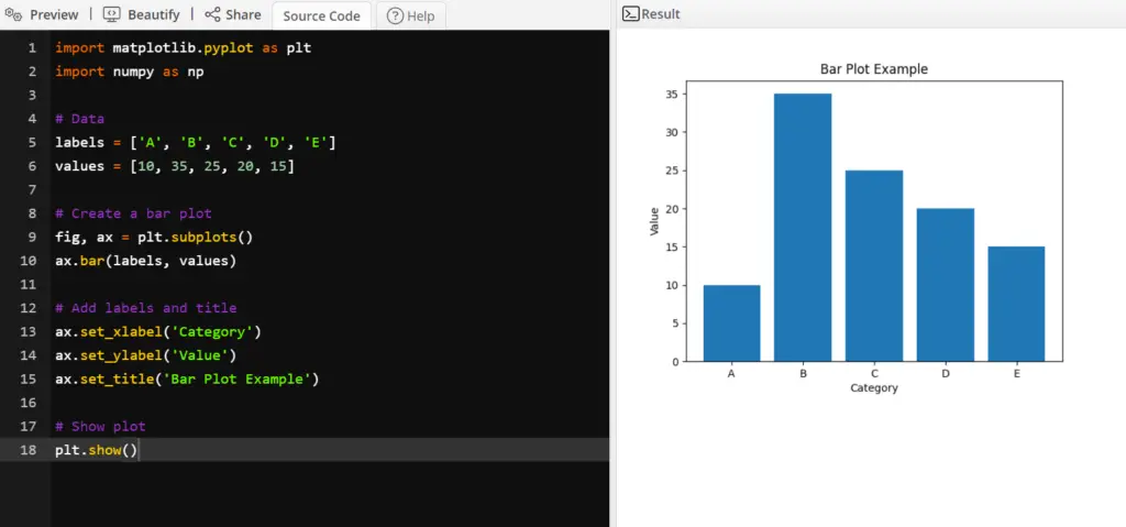
In this example, we first import the necessary libraries – Matplotlib and NumPy. We then define the data that we want to plot using two lists – labels and values.
Next, we create a bar plot using the bar() function of Matplotlib’s Axes class. We pass in the labels and values lists as arguments to the bar() function. This creates a bar plot with the category labels on the x-axis and the corresponding values on the y-axis.
We then add labels to the x and y-axis using the set_xlabel() and set_ylabel() methods of the Axes class, respectively. Finally, we add a title to the plot using the set_title() method.
The show() function is used to display the plot on the screen. Here’s the output of this code:
Adding Labels and Titles
Adding labels and titles to your bar plot is crucial to making it informative and easy to understand. You can add labels to the x and y-axis using the xlabel() and ylabel() functions, respectively. You can also add a title to the plot using the title() function. These functions allow you to customize the font size, color, and other parameters to make your plot stand out.
Advanced Customizations
Matplotlib provides a wide range of customization options to create bar plots that suit your specific needs. For instance, you can change the orientation of the plot, add error bars, and group bars to display multiple variables. You can also create stacked bar plots to show the distribution of data across multiple categories.
15 ways to create bar plot in python
Here we discuss almost 15 ways to create bar plot using python.
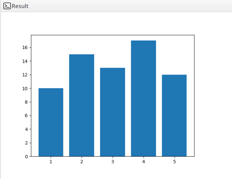
1. Matplotlib – using the bar() function:
import matplotlib.pyplot as plt

x = [1, 2, 3, 4, 5]
y = [10, 15, 13, 17, 12]

plt.bar(x, y)
plt.show()
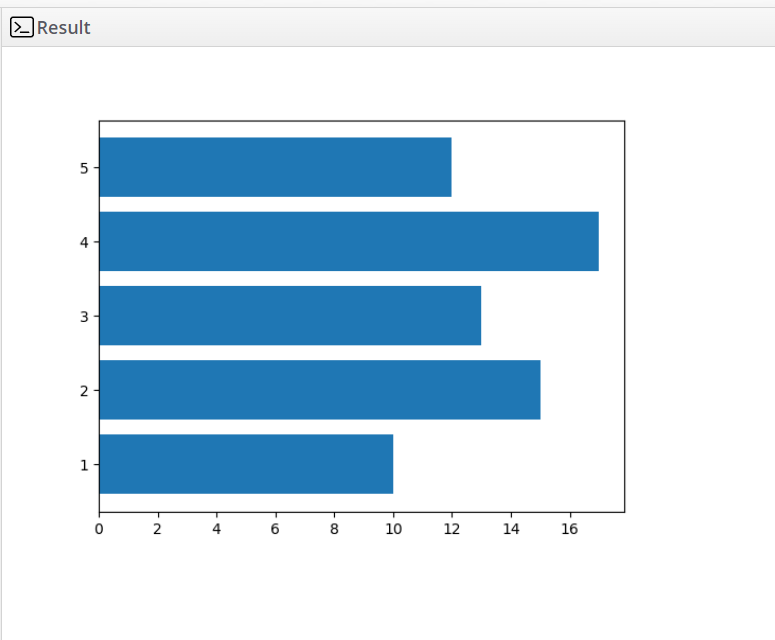
2. Matplotlib – using the barh() function to create a horizontal bar plot:
import matplotlib.pyplot as plt

x = [1, 2, 3, 4, 5]
y = [10, 15, 13, 17, 12]

plt.barh(x, y)
plt.show()
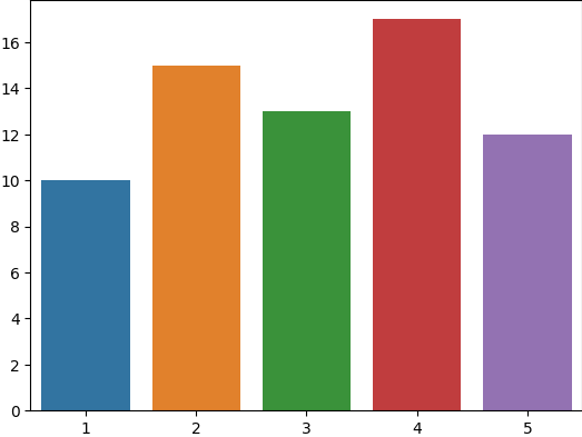
3. Seaborn – using the barplot() function:
import seaborn as sns
import matplotlib.pyplot as plt

x = [1, 2, 3, 4, 5]
y = [10, 15, 13, 17, 12]

sns.barplot(x=x, y=y)
plt.show()
4. Plotly – using the bar() function:
import plotly.express as px

x = [1, 2, 3, 4, 5]
y = [10, 15, 13, 17, 12]

fig = px.bar(x=x, y=y)
fig.show()
5. Bokeh – using the vbar() function:
from bokeh.io import show
from bokeh.plotting import figure

x = [1, 2, 3, 4, 5]
y = [10, 15, 13, 17, 12]

p = figure(x_range=[str(i) for i in x], plot_height=250)
p.vbar(x=[str(i) for i in x], top=y, width=0.9)

show(p)
6. Pandas – using the plot() function with kind=’bar’:
import pandas as pd

data = {'x': [1, 2, 3, 4, 5], 'y': [10, 15, 13, 17, 12]}
df = pd.DataFrame(data)

ax = df.plot(x='x', y='y', kind='bar')
ax.set_xticklabels(df['x'])

plt.show()
7. Altair – using the mark_bar() function:
import altair as alt
import pandas as pd

data = {'x': [1, 2, 3, 4, 5], 'y': [10, 15, 13, 17, 12]}
df = pd.DataFrame(data)

alt.Chart(df).mark_bar().encode(x='x', y='y').show()
8. ggplot – using the geom_bar() function:
from ggplot import *

data = {'x': [1, 2, 3, 4, 5], 'y': [10, 15, 13, 17, 12]}
df = pd.DataFrame(data)

ggplot(df, aes(x='x', y='y')) + geom_bar(stat='identity')
9. HoloViews – using the bars() function:
import holoviews as hv
from holoviews import dim, opts

hv.extension('bokeh')

data = {'x': [1, 2, 3, 4, 5], 'y': [10, 15, 13, 17, 12]}
curve = hv.Curve(data, 'x', 'y')

bars = hv.Bars(data, ['x', 'y'])
bars.opts(opts.Bars(color='x', cmap='viridis', tools=['hover'], width=500))

overlay = (bars * curve).opts(opts.Curve(line_width=2, color='black', tools=['hover']))
overlay
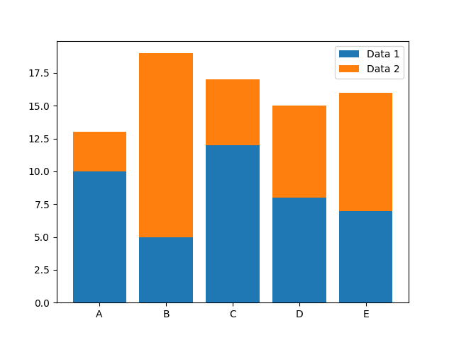
10. Stacked Bar Plot
A stacked bar plot is used to display the total amount across multiple groups and the breakdown of the groups’ value into sub-groups. In Matplotlib, you can create a stacked bar plot by setting the bottom parameter for the second bar to the top of the first bar.
import matplotlib.pyplot as plt
import numpy as np

# Create sample data
categories = ['A', 'B', 'C', 'D', 'E']
data1 = [10, 5, 12, 8, 7]
data2 = [3, 14, 5, 7, 9]

# Create stacked bar plot
plt.bar(categories, data1, label='Data 1')
plt.bar(categories, data2, bottom=data1, label='Data 2')
plt.legend()
plt.show()
11.Horizontal Bar Plot
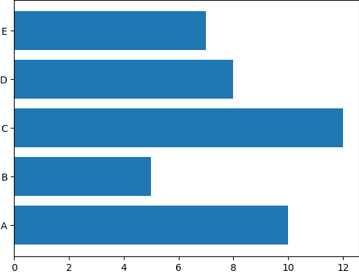
Sometimes it’s more convenient to display a bar plot horizontally, rather than vertically. Matplotlib makes it easy to create a horizontal bar plot by using the barh() function instead of bar().
import matplotlib.pyplot as plt
import numpy as np

# Create sample data
categories = ['A', 'B', 'C', 'D', 'E']
data = [10, 5, 12, 8, 7]

# Create horizontal bar plot
plt.barh(categories, data)
plt.show()
12. Grouped Horizontal Bar Plot
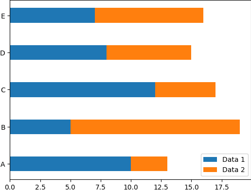
Similarly to the grouped vertical bar plot, you can also create a grouped horizontal bar plot. To do this, you can use the barh() function multiple times, adjusting the height parameter to create the grouping effect.
import matplotlib.pyplot as plt
import numpy as np

# Create sample data
categories = ['A', 'B', 'C', 'D', 'E']
data1 = [10, 5, 12, 8, 7]
data2 = [3, 14, 5, 7, 9]

# Create grouped horizontal bar plot
bar_width = 0.4
plt.barh(categories, data1, bar_width, label='Data 1')
plt.barh(categories, data2, bar_width, left=data1, label='Data 2')
plt.legend()
plt.show()
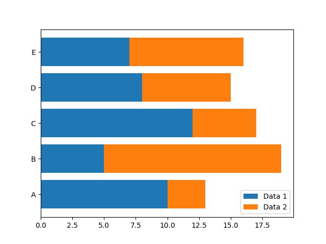
13. Stacked Horizontal Bar Plot
Finally, you can create a stacked horizontal bar plot by setting the left parameter for the second bar to the right of the first bar.
import matplotlib.pyplot as plt
import numpy as np

# Create sample data
categories = ['A', 'B', 'C', 'D', 'E']
data1 = [10, 5, 12, 8, 7]
data2 = [3, 14, 5, 7, 9]

# Create stacked horizontal bar plot
plt.barh(categories, data1, label='Data 1')
plt.barh(categories, data2, left=data1, label='Data 2')
plt.legend()
plt.show()
14. Creating a horizontal bar plot using the Seaborn library:
import seaborn as sns
import matplotlib.pyplot as plt

# create sample data
x = ['A', 'B', 'C', 'D']
y = [10, 8, 12, 6]

# create horizontal bar plot
sns.set_style('whitegrid')
plt.figure(figsize=(8, 4))
sns.barplot(x=y, y=x, palette='Blues')
plt.xlabel('Count')
plt.ylabel('Category')
plt.title('Horizontal Bar Plot')
plt.show()
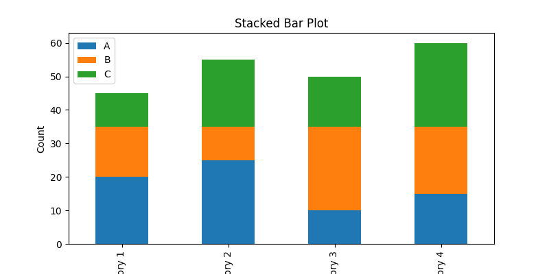
15. Creating a stacked bar plot using the Pandas library:
import pandas as pd
import matplotlib.pyplot as plt

# create sample data
data = {'A': [20, 25, 10, 15], 'B': [15, 10, 25, 20], 'C': [10, 20, 15, 25]}
df = pd.DataFrame(data, index=['Category 1', 'Category 2', 'Category 3', 'Category 4'])

# create stacked bar plot
ax = df.plot(kind='bar', stacked=True, figsize=(8, 4))
ax.set_xlabel('Category')
ax.set_ylabel('Count')
ax.set_title('Stacked Bar Plot')
plt.show()
Conclusion
In conclusion, creating high-quality bar plots in Python is an essential skill for any data scientist. By following the steps outlined in this guide, you can create informative and visually appealing bar plots that will help you better understand your data. With Matplotlib’s extensive customization options, you can tailor your plots to suit your specific needs.
What is a bar plot?
A bar plot, also known as a bar chart, is a visualization tool that displays categorical data with rectangular bars. The length of each bar represents the value of the category being plotted.
Can I customize the appearance of my bar plot?
Yes, you can customize various aspects of your bar plot, such as the color, width, and style of the bars, as well as the axis labels and ticks, using the relevant functions and parameters of your chosen library.
What is the difference between a bar plot and a histogram?
While both bar plots and histograms display data using rectangular bars, they are used for different types of data. Bar plots are used for categorical data, where each bar represents a discrete category, while histograms are used for continuous data, where the bars represent ranges of values.
How do I choose between a horizontal and vertical bar plot?
The choice between a horizontal and vertical bar plot depends on the nature of the data and the intended message of the plot. In general, a vertical bar plot is preferred for a small number of categories, while a horizontal bar plot is preferred for a large number of categories or when the category labels are long. However, you should experiment with both options and choose the one that best represents your data and conveys your message.
What are the different types of bar graphs in Python?
There are several types of bar graphs in Python, including vertical bar graphs, horizontal bar graphs, stacked bar graphs, and grouped bar graphs.
